Visualizing Police Accountability Records in Chicago, IL
(Winter 2021) This visualization was created as part of an assignment focused on the representation of data-rich information. Students were asked to draw inspiration for their designs from W.E.B. DuBois’ groundbreaking data portraits and work with any publicly available dataset to create an exhibitory, museum-esque visualization. For this visualization, I selected police complaint records from Chicago’s Civilian Office of Public Accountability (COPA), and created the visualization entirely inside of Adobe Illustrator while ensuring different components of the chart remained proportional to the underlying data.
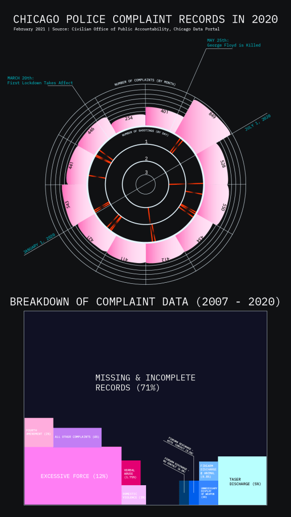
How to read this chart:
The top figure represents the monthly number of complaint records and daily number of police shootings captured by the dataset. The chart can be read like a year-long “clock” starting in the bottom-left at January 1st and moving clockwise. Call-outs highlight the noticeable dampening of activity in the months directly following the first COVID-19 lockdowns as well as the enormous uptick in June 2020 in the wake of the murder of George Floyd.
The bottom figure represents the volume of missing and incomplete records— over 70% of the entire dataset. These records lack various pieces of crucial information about incidents and demonstrate a major shortcoming of this data’s ability to provide accountability for the actions of police.